In Norwegian this is called a ‘realitetsorientering’.
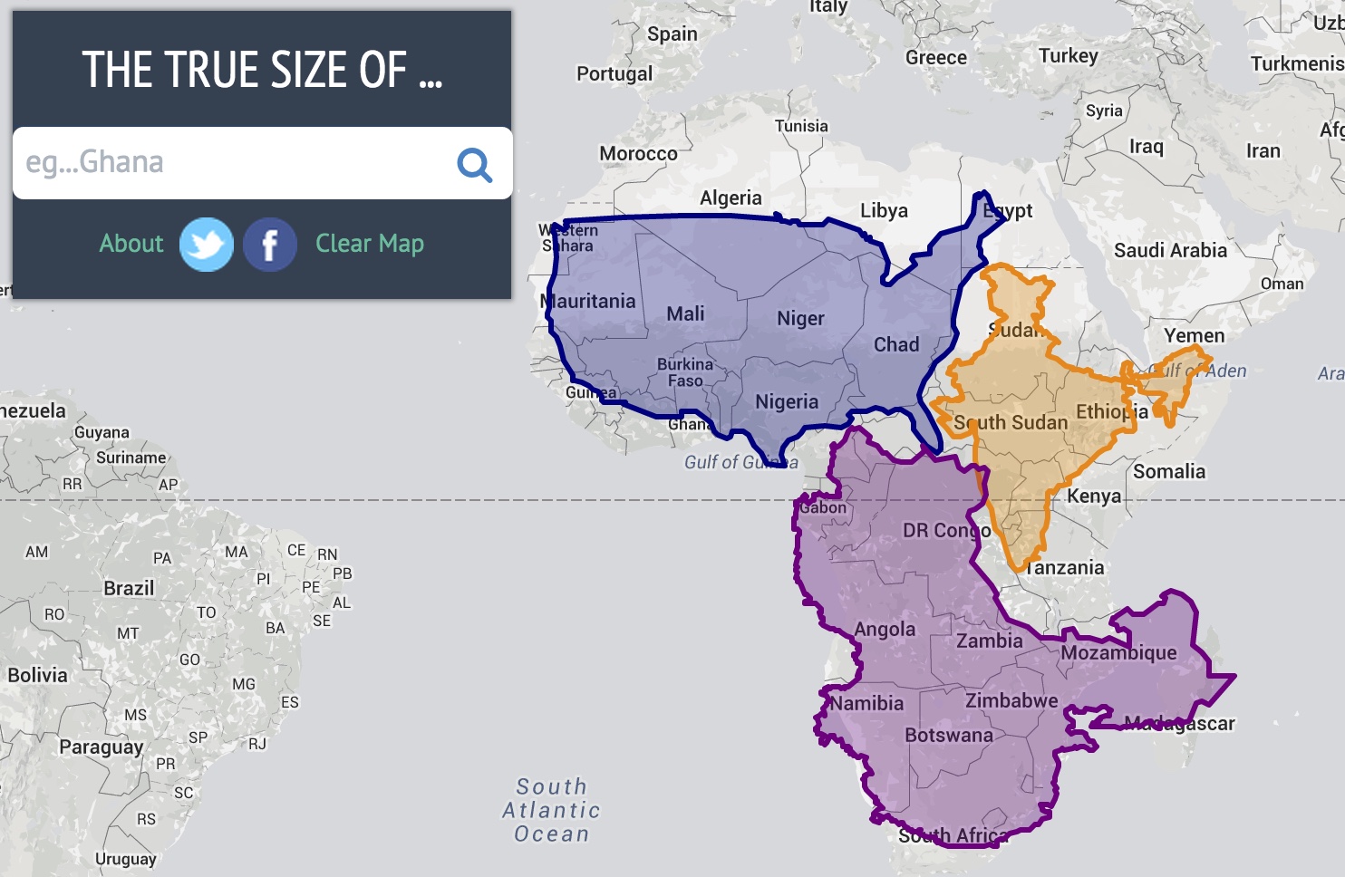
Every map projection introduces distortion, and each has its own set of problems. One of the most common criticisms of the Mercator map is that it exaggerates the size of countries nearer the poles (US, Russia, Europe), while downplaying the size of those near the equator (the African Continent).
Check out the link below.

Compare countries with this simple tool
Drag and drop countries around the map to compare their relative size
